Plan
New400 Pro blocks and 20 templates
Accessible components that look finished on day one.
61 React components built on React Aria and shadcn tokens. Copy them into your app, theme them with a few variables, and keep every line of code.
npx shadcn@latest add @desyne/buttonTheme

Maya Chen
maya@acme.dev
Plan
October 2026
| Sun | Mon | Tue | Wed | Thu | Fri | Sat |
|---|---|---|---|---|---|---|
27 | 28 | 29 | 30 | 1 | 2 | 3 |
4 | 5 | 6 | 7 | 8 | 9 | 10 |
11 | 12 | 13 | 14 | 15 | 16 | 17 |
18 | 19 | 20 | 21 | 22 | 23 | 24 |
25 | 26 | 27 | 28 | 29 | 30 | 31 |
Storage
52 / 82 GB
SyncedEU region
- components with docs
- 61
- live, editable examples
- 730
- locales, RTL included
- 30+
- of the source in your repo
- 100%
Recipes
Real patterns, not just primitives. Try them right here.
Estimate your bill
$12 per seat, $0.25 per GB of storage.
Estimated monthly
$425
Two-factor authentication
Enter the code from your authenticator app.
React
TypeScript
Accessibility
Put the mouse down. Everything still works.
Focus management, keyboard navigation and screen-reader announcements come from React Aria, the hooks behind Adobe’s design systems. Tab through the form and watch.
Delivery date
mmddyyyy
Speed
Theming
Your brand in a few variables. Every component follows.
Tokens
shadcn variable names. Change a value and every component follows, in light and dark.
:root {
  --brand: oklch(0.56 0.14 160);
  --radius: 0.5rem;
}
.dark {
  --brand: oklch(0.72 0.14 160);
}
Tones
One color prop on buttons, badges, alerts and progress, backed by two variables.
<Button color="brand">Deploy</Button>
<Badge color="success" variant="soft">
  Live
</Badge>
<Alert color="warning">…</Alert>
Density
Controls share one 28 / 32 / 40px height scale, so mixed rows line up.
<TextField size="sm" />  // 28px
<Select size="md" />     // 32px
<Button size="lg">       // 40px
  Save
</Button>
Open code
A dependency you can read. Because it’s not one.
The shadcn CLI writes plain source into your repo. Change anything; there’s no upstream to fight.
Terminal
$ npx shadcn@latest add @desyne/switch
✔ Checking registry.
✔ Installing dependencies: react-aria-components
✔ Created 3 files:
  - components/ui/switch.tsx
  - components/ui/field.tsx
  - lib/utils.ts

$ ▍
Desyne Pro
Stop assembling. Start from whole pages.
400 blocks and 20 multi-page templates built from these same components, with real content, dark mode and every state designed.
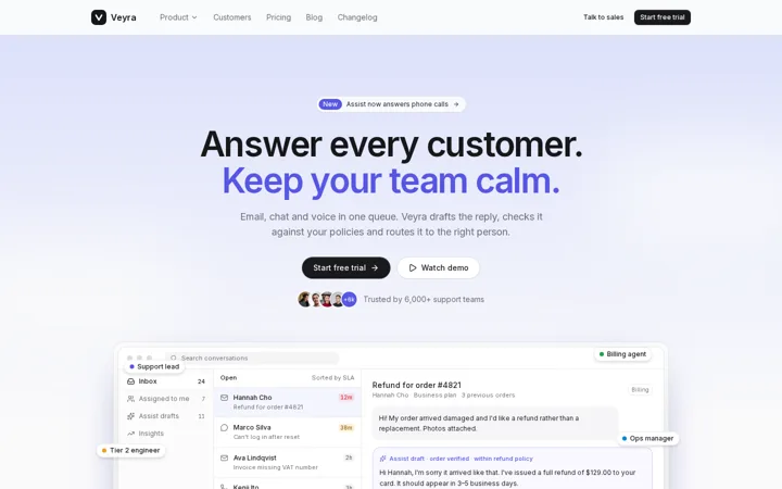
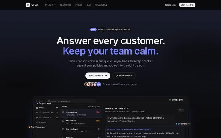
VeyraMarketing site for a support platform
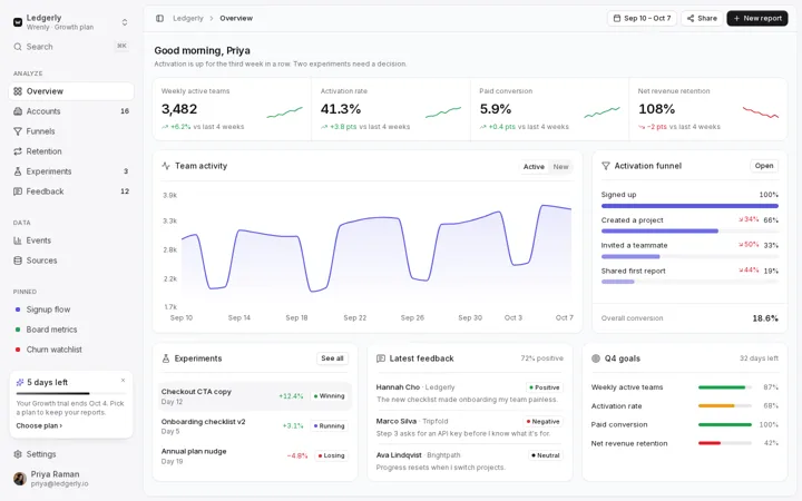
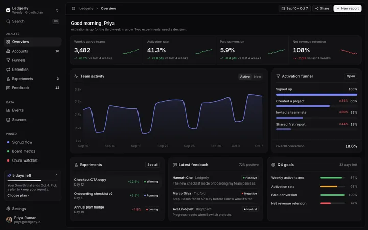
WrenlyProduct analytics SaaS app
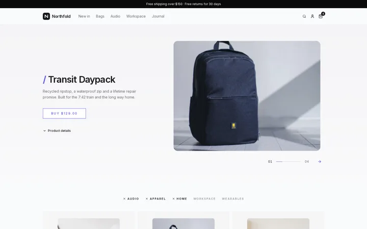
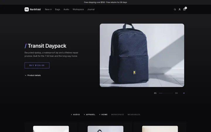
NorthfoldStorefront for an everyday gear brand


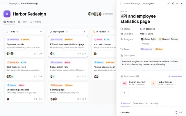
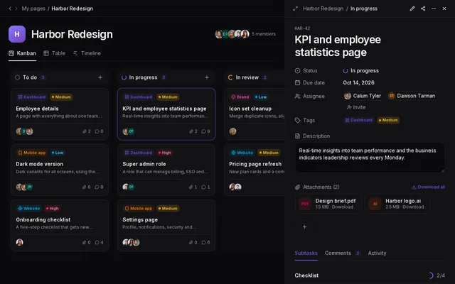
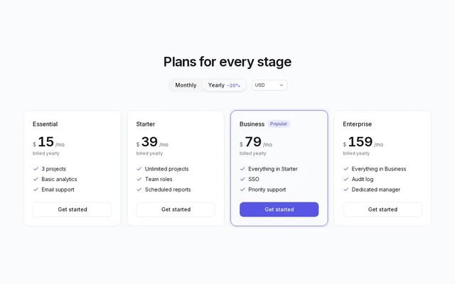
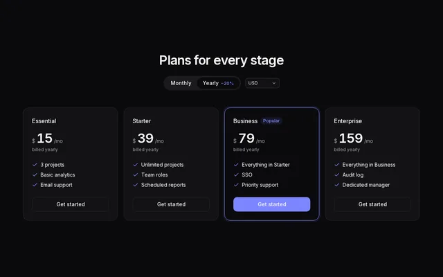
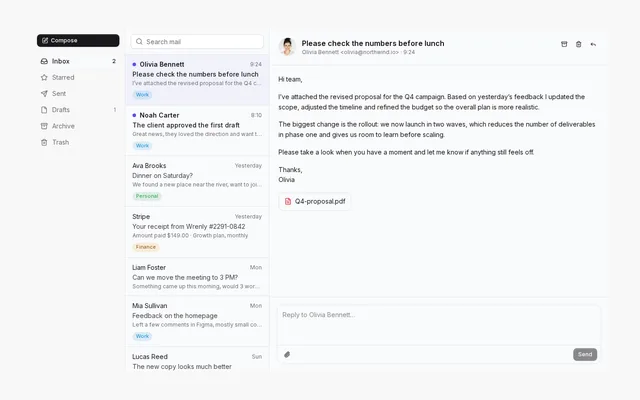
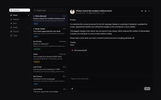
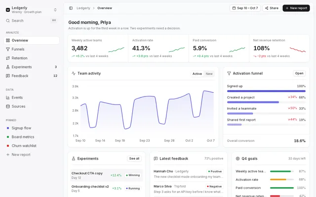
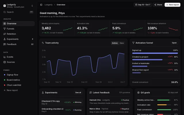
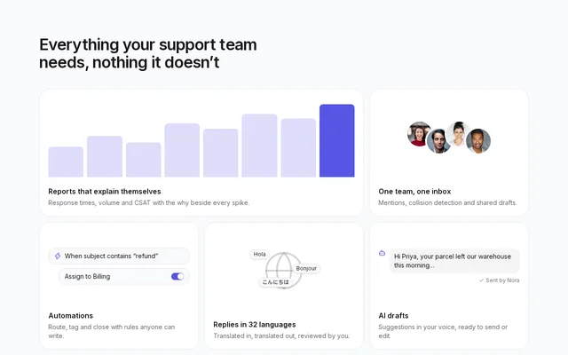
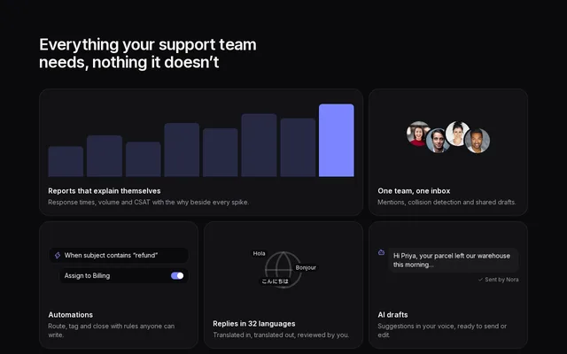
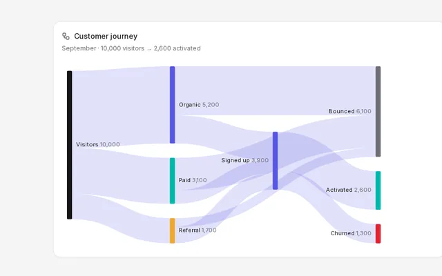
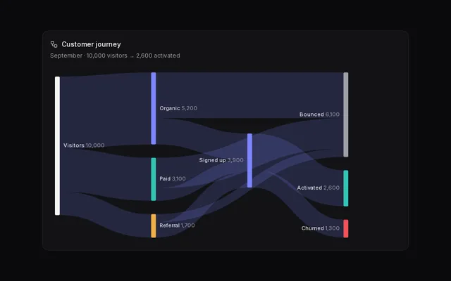
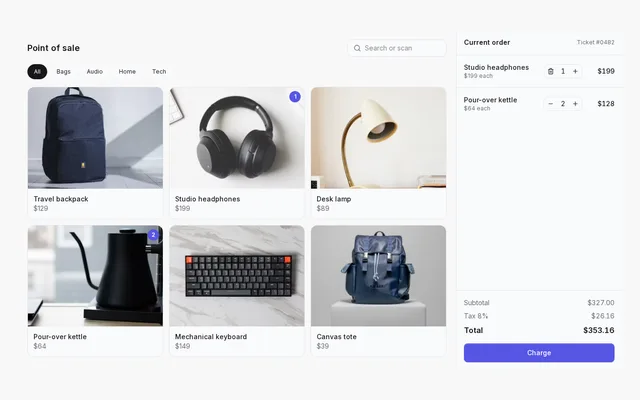
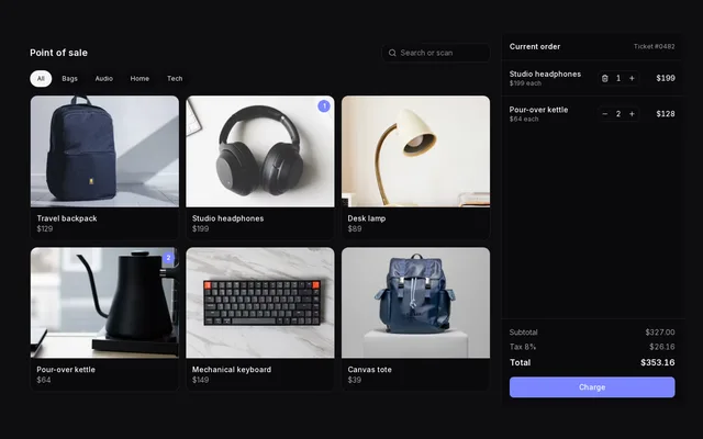
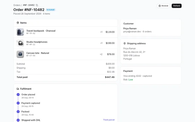
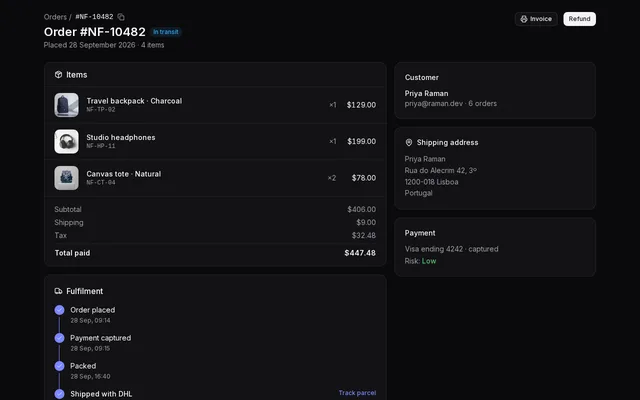
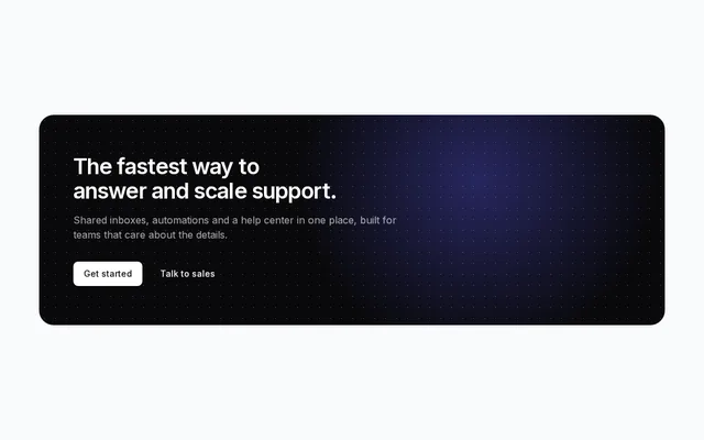
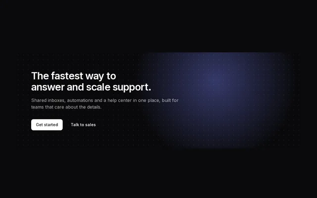
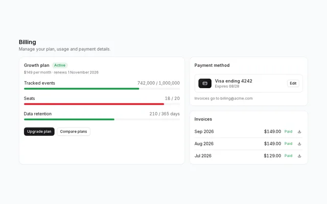
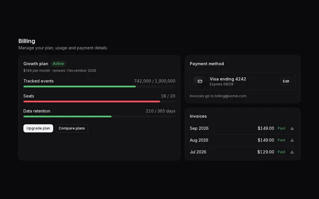
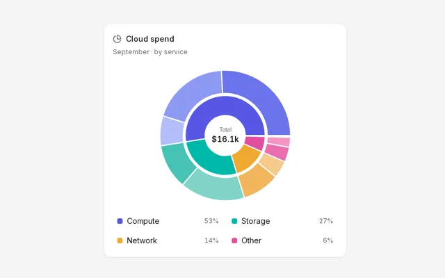
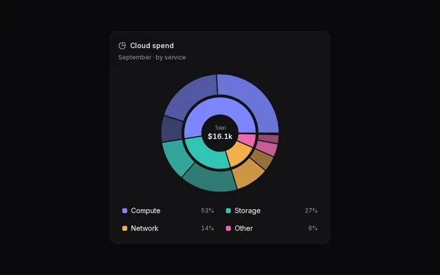
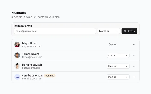
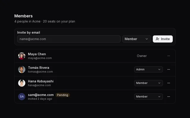
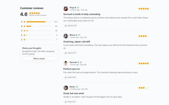
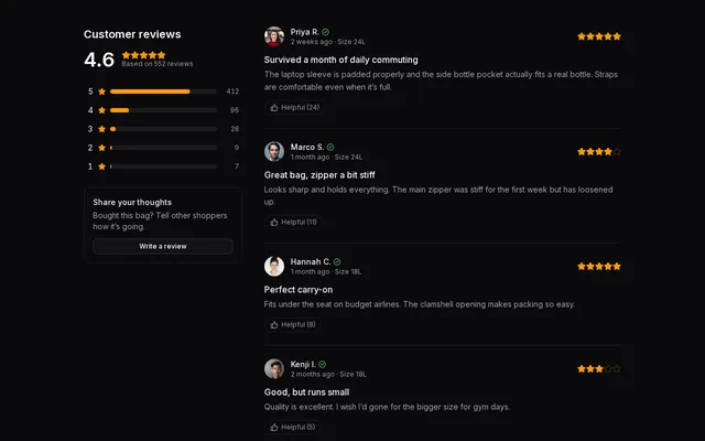
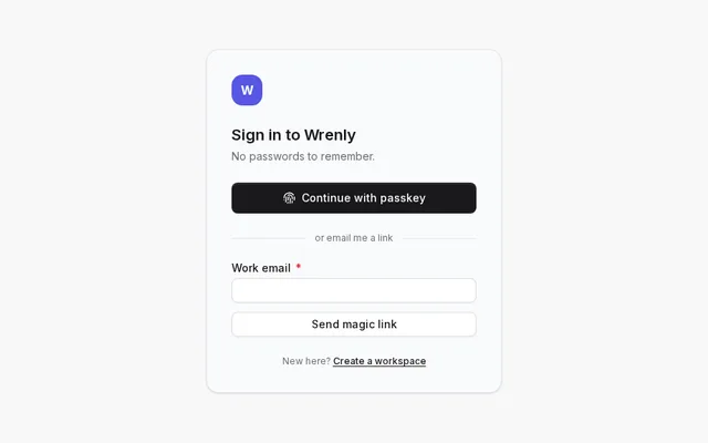
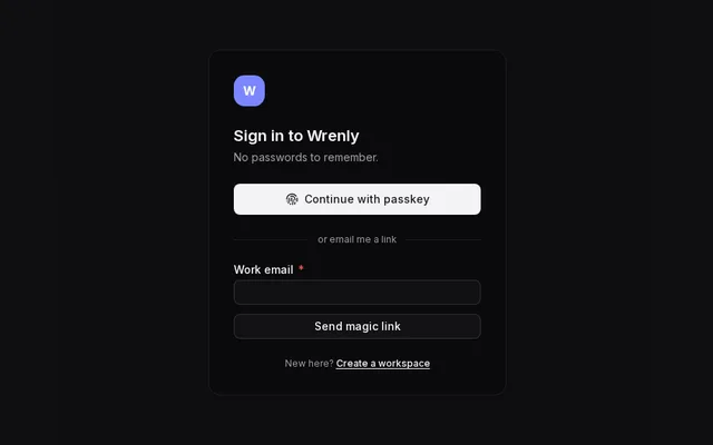
The free library is every core component — buttons, forms, overlays, collections and more — installed with the shadcn CLI. Pro adds production-ready blocks and full-page templates built from those components: dashboards, marketing sections, authentication flows and app screens.
Ship the interface your product deserves.
Start free in a minute. Upgrade when you want whole pages.